Sunday, February 5, 2012

Visit-The Freelon Group / Discussion-Paula Carr

The Freelon Group is a well known architecture firm, so having the opportunity to visit it was exciting! Their style is modern and open, we could see that in their office as well as the library they designed. Everyone who spoke to us was excited to explain the types of projects they worked on and gave helpful insight into the many tasks an architect, designer, marketing person, or model builder is involved with. I appreciated the straight forward, solid advice we were given on how to market ourselves as new designers. As we toured the first floor of The Freelon Group, I gained an understanding of how involved the design process is. It starts in the conference room where the architects and designers talk with the clients about their ideas for a project. Then several people start working together and ultimately end up back in the conference room with a polished presentation for the client. This is repeated on projects such as the Durham County Library, as we clearly saw the level of attention this Freelon project received. Not only does The Freelon Group give attention to the design, but the firm was established with 'two fundamental principles in mind: that clear, strong ideas drive design excellence and that the REACH of architecture – the buildings and the profession – can and should extend beyond traditional limits.' Their project list has so many public places that were designed in the hopes of 'providing venues for the exchange of ideas.' I was impressed by the specific projects that will be on exhibit at MIT later this month. The theme REACH is so appropriate. And we are all very impressed that they have won the competition to design the new African American Museum that will be built on the Washington, DC Mall!
Being exposed to firms like The Freelon Group, and earlier in the semester tvsdesign, expand my previous knowledge of the types of jobs that will be available to me when I graduate. It was convenient that The Freelon Group is close to UNCG, because being able to visit the firm gave me a better understanding of the type of firm it was. I don't have a full picture of tvsdesign even though Paula Carr's presentation showed their projects. Since she focused more on her personal design process, her final designs, and less about the firm itself, I felt more connected to her as a designer than I did at Freelon. I think starting zoomed in with Paula and then zoomed out with Freelon has given me a full range of what to expect when I become a degree holding designer.
Durham County Library - The Freelon Group
Sample model and presentation board - The Freelon Group

Friday, January 13, 2012

Wednesday, January 11, 2012

"Computing in Architectural Design"

Architects and designers have come along way from just using a compass and straightedge in computing components of a building. Computers have proven to be incredible assistants to humans and over the years they have become even more powerful tools. Since the 1960s universities have been a leading force in the development of computer aided design to service the building industry. Their first systems were slow and only really helped with basic lines and geometry. By the 1970s they were being used for more complex curves, manufacturing abilities, structural tolerances, and space planning. In 1974 the Computer Aided Engineering and Architectural Design System were designed to analyze habitability, energy use, and building specifications. By the Second-Generation CAD Systems many advances in such things as the personal computer and the mouse made these systems affordable to the larger architectural community. In 1984 the Macintosh and ink jet printers made greater output possible but the systems did lack the ability to include unique details of a building. In some areas of CAD it seemed like things were "dumbing down" but there were other areas the were becoming more intelligent. The search for technology to serve many different roles is always evolving to become more intuitive for the designer and ultimately more helpful. They can help us see beyond our own eyes and catch things humans may overlook. To this day, Third-Generation CAD Systems are still being developed to handle more complex operations. Their role is to be our tool in the design process. They draw, are a measuring instrument, and produce modeling to help us visualize every step of the building process in a more complete and complex way then the industry could have ever imagined.

Friday, December 10, 2010

point : explorations

The main themes in the Unit – Explorations, are Growth, Simplicity, and Where Do We Go From Here? Architecture is changing because machine and man are working together, and innovation can be seen in different ways. Design is influenced on many levels through the study of new materials and how they come together, as well as the study of movement through the invention of the automobile and the elevator. All these changes are happening so fast it makes me wonder, what is the dominating story?

New York and Chicago are two major cities where growth can be seen in their impressive skylines. Machines, steel, and concrete were the main parts of the thread that helped create skyscrapers. We can see three important moments in these buildings, how they touch the ground, how they hit the sky, and what happened in the middle. I appreciate the attention that was given to these moments considering it must have been a challenge to incorporate good design in such a massive structure. Designers went back in time to help with this challenge. We can see it in the Gothic style of the Trinity Church in New York, and the Renaissance style in the wavy exterior on the Reliance Building in Chicago. Looking back is always important, but the industrial revolution was about looking forward and created positive economic changes that were so desperately needed.

Art Nouveau continued this trend of only moving forward. The ever-moving line seen in curved steel and geometric flowing wall coverings, invited people to stop and appreciate the design as they passed by. Geometry creates form and our professor said, “Form itself is what we appreciate.” We are mesmerized by the trippy architecture and this brings enjoyment to the people. Building on this, we move to the glamorous Art Deco period that is really all about enjoyment for the people. This is the time when the movies start, and movement and optical illusion are their main focus. Both of these styles are embraced for a short time but then we move toward simplicity.

Charles and Ray Eames lead the way with their furniture designs and famous case study house called, Eames House. All the parts of the structure were manufactured off site, then transported, and finally, simply put together like a puzzle. The design had to be well thought out since it needed to come together seamlessly on site. This must have been a challenge to avoid any errors on the day of installation. Their use of bold colors and textiles made this home have a different feeling than some of the other modern buildings that were being criticized for feeling cold. They seem to have been a popular design team because unlike other modern designers, they were not just designing for themselves, but for others as well. Interior design started soon after because very few architects were listening to what people wanted for their interior spaces.

The intentions of interior designers are good, but over decorating interior spaces have created a quick fix to the problem. We now transport stuff from all over the world without consideration of the impact this has on the earth. This also promotes surface verses substance. Who has better stuff in their homes instead of thinking about the community and what could make it better. Everyone likes to look at nice things at home or work, but at what expense? Designers need to be the leaders in promoting awareness of what will be left behind. The first unit we studied this semester was about spirituality, religion, power, and measuring the stars. In my first unit summary I wrote, Architecture shows us about our values, successes and failures, aspirations, physical and social needs, cross-cultural insights, attitudes towards nature, and techniques available at a certain time in history. It is important though to remember the way Vitruvius saw it, stay balanced and keep it simple. I picked the image below because the last thing our class discussed was coming FULL CIRCLE in how we design. This term is important to me and that is why my blog is called Full Circle. I want to constantly look back, look forward, and always keep moving in a positive direction.
https://blogger.googleusercontent.com/img/b/R29vZ2xl/AVvXsEjrxXB8Tz0cHKbG8C_jc7RsKfHtNrdhbTwGxhJVEcLMd99L2VTpt8A71Mvb-uEgGIlUTpdwLk3svFJ-B4jkwtMF0YSzKU1vr0WcWG7pBOe1RZMLvPWfVeZXq5TnqRxMvBp9qc7ja94H0n3c/s320/Full+circle.jpg

Friday, November 12, 2010

Reflections Summary

"When we first began our study of reflections I immediately thought of water and its ability to return light from its surface and project a rippled representation of the world around it. This is similar to the way in which architecture has the tendency to reflect the culture of the society that built it." ~ Kelly

Water Lilies, Monet

"Eastern Influence can easily be seen in the Peacock Room. Designed by James Whistler from 1876-1877, the surface decorations on the walls - forming a sort of cage - to display eastern pottery and china was one of the first forms of true interior architecture." ~ Audra

Peacock Room


"As my father often said, there is not a first without a second, and we do not under estimate anyone because we might need them one day." ~ Jasmine

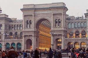
Galleria Vittorio Emanuele II

I pulled the quotes and images above from three of my classmate's essays on the Reflections Unit because I think they explained the main points very well. Kelly connects Monet's Water Lilies painting on every level to the revolution that is happening in architecture and design. I really appreciate the way she connected the painting to Vivaldi's symphony we listened to in class and then connected it to Versailles. She says, "The floating melodies, and the structured rhythm of the Autumn movement from Vivaldi’s Four Seasons Suite reflects the fluidity of parts to the whole within the formality of the axial layout of the space." Art, music, and architecture were changing together and showing that designers, artists, and musicians were trying to capture the essence of their subject. In the revolution process, some styles stayed and some didn't. Audra states that this process is called "The Revolution of Excess" and Eastern influence is key to toning down the excess. The Peacock Room is beautiful and exotic, but the straight lines and simple color pallet allow it to be dramatic yet calming at the same time. She says "the surface decorations on the walls - forming a sort of cage - to display eastern pottery and china was one of the first forms of true interior architecture." Even though there a many pieces displayed on the walls, the space doesn't seem cluttered at all. Revolution was not only seen in interiors, but grand buildings such as the Galleria Vittorio Emanuele II in Milan were showing what new materials such as glass and iron could create. The interesting thing is that as design moved forward, the past was not forgotten. Stone is still a major material used in this building. Jasmine states, "In my opinion, very few buildings are as beautiful and successful as this one in bringing together the old with the new, into a seamless dance of shadows and lights, moving among the heavy stone walls."

Alternatives Summary

"The Alternatives unit continues into the Baroque period where breaking rules and the boundaries becomes the alternate to design. Baroque suggests more fluidity, spilling over the edges, challenging authorities, and testing limits." ~ Kathryn

Laurentian Library Vestibule

"Another one of the ways to sum up the Renaissance period was not only the rebirth or creation of something new, but the combination of classical movement, beauty and architecture." ~ Jessica

Renaissance Detail


I didn't see a post on Jamaan Simons blog?

Monday, November 8, 2010

point : reflections

The main theme in the Unit – Reflections, is the Process Of Change. We observe the design principles being pushed outside the box and since there are many voices planning what will come next, moving forward is the only way to stop the talk and see the change realized. By incorporating Roman, Greek, and Gothic revivals into architecture, scale and new materials produce amazing structures that change society. Commerce begins to be the new religion and the goods brought from the East introduce a worldliness that Europe and America enjoy.

It is hard for people to make a change before reflecting on why they want the change in the first place. It is really important for designers to look back to the foundations of architecture and the alternatives already tried, and then, start thinking and talking about what comes next. It is very interesting that at the same time in history that all the revival styles were spinning around, the mirror was invented and we could stop, focus, and reflect. Looking back at our selves to find what needed to be corrected was probably just as significant as looking to the architecture for the answers.

As industrial and political revolutions were flipping the world on its head, England and America were changing design at every level. Furniture was rejecting curves and more simple straight lines were brought back. Practical things such as wheels were put on tables for mobility. Thomas Jefferson brings the Roman revival back from France and columns and domes are seen in the new government buildings in Virginia and Washington, DC. As the country moves south and west the Greek revival is seen in the government buildings in North Carolina and Tennessee. The scale of these buildings relate strongly to Roman and Greek architecture, and when size and new materials such as glass and iron are introduced in the 19th century, Gothic revival is also apparent. Gallerias, Libraries, and exhibition halls allowed for massive open spaces for expanding the minds and level of enjoyment of the people.

Change is usually good. The industrial revolution is the bridge that connects the world and leads Europe and America towards a modern society. People are reading about other cultures and buying exports from the East, which allows their way of thinking to change. Designers involve themselves in this movement by creating beautiful art, artifacts, interiors, clothes, and architecture that incorporate nature and simplicity learned from the East.


I chose the image above because there isn't anything more appropriate than a cartwheel to explain the unit on Reflections and Revolution. I will never forget the demonstration in class! The 1st part of the cartwheel is moving outside the box. The 2nd part is stretching somewhere. The 3rd part is hands on the ground - suspending the world. And the 4th part is coming right side up and rewriting the rules.

Wednesday, November 3, 2010

Reading Comprehension 5

[1]

Interior Design Since 1900 . Anne Massey . page 29 . Image 21

The Eastlake inspired desk above represents revolution in design by incorporating the simple straight lines found in Japanese furniture. Louis Comfort Tiffany designed his New York flat to include naturalistic forms in his wall treatments and accessories, as well as the furniture he chose for the space. In 1883 it was important for people to show worldliness and a connection to the East through the treasures showcased in their homes. Having a large artifact such as this desk with beautifully hand carved details spoke the same language that William Morris was trying to express with his designs. Arts and Crafts designers felt strongly that simple hand crafted furniture would be the revolution that everyone needed. We needed to reconnect with ourselves and the earth and not be so dependent on machines to mass produce everything. Going back to simplicity and nature represents Asian influence in Western design.

[2]

Artifact
Sevres Porcelain Factory - Sevres, France - 1862-76
Tea service with bamboo design

The intricate designs on the porcelain tea set below shows the influence of handcrafted artifacts being reintroduced into the western world. The handle and carved details resemble Asian furniture and are exotic yet simple.

http://sccp.main.jp/modules/tinyd2/rewrite/tc_9.html

Space
Morning Room - Louis Tiffany - Hartford, CT - 1881

Color is the most important part of this space that connects the design to Asia, the Middle East, and India. Vibrant reds and greens as well as gold are used in the East a lot. The Oriental or Persian carpets included in this room are one of the most important things in homes to show wealth. They are hand woven and extremely expensive.

http://www.oldhouseonline.com/aesthetic-movement-lighting/

Building
The Guimet Museum of Asian Art - Paris, France - 1885

The front of this building looks very similar to Chinese architecture. Compare the Museum in Paris to the building below in China. The bottom is solid and simple while the middle and top have more elaborate and repeating details. Both buildings have the point at the top to help bring the viewers attention all the way up the building.

http://img.metblogs.com/paris/files/2008/07/dscn5546.JPG

http://www.solomon.cps.k12.il.us/images/hall.jpg

Place
Japanese Garden, Park Clingendael - The Hague, Netherlands -1910

In the late 19th century Bonsai Trees were included in various international exhibitions and people started to incorporate Japanese trees and plants into their landscape designs. The small building in the garden resembles a traditional Japanese home and the red bridges connected a popular Japanese color to this place.

Monday, October 25, 2010

point : alternatives

The main theme in Unit 3 – Alternatives, is to Know the Rules before you Break the Rules. We are taught at a very young age to follow rules no matter if we agree with them or not. The people who help guide our lives do this to keep us on the right path until we can make good decisions for ourselves. If we did not have this instruction and direction unnecessary mistakes are made and our potential would not be realized. The same thing is true in design. The foundations of architecture have taught us where design started and how important it is to learn from designers before us so that when alternatives are introduced there is a greater chance for success.

Since Egypt, geometry has guided us and will continue to be a repeating theme as the rules are applied and then broken. The complexity of the geometric matrix used in the design of the Amiens Cathedral in France is interesting to me because it moves us from mathematics to illusions. Keeping within the rules of geometry, Gothic details are added and become the dominant focus. This concept is important because the church represents the whole universe; both logic and spirituality are represented in this monumental building. The Cathedral at Florence is an example of another church that also reaches vertically toward heaven. Through the grouping of columns they become stronger and make it possible for them to reach higher. The light that came into the space at the top of the highest point was intentional, dramatic, and resembled The Divine.

Geometry continues to be present in the Villa Rotunda and the Villa Barbaro designed by Palladio. Circles, squares, proportion, and rhythm are simple to understand and are repeated in these buildings. Villas were all about the control of the designer. Palladio wanted to tell the people what to feel, where to look, and where to walk. He wants them to feel relaxed, entertained, and worldly. He wants them to see the landscape from specific locations, and have a definite direction in which they enter and leave the villas. This control makes Palladio the Man who is the Measurer of all Things.

Michael Angelo continued to use geometry during the Renaissance but added to it with his own ideas of testing limits. Bringing new shapes such as ovals and trapezoids allowed his architecture to have embracing entrance spaces. I appreciate the way he mixed previous styles such as Gothic and Classical with the upcoming Baroque style. He obviously saved room in his mind to design with innovation as the leading drive. Also incorporating water features and movement brought theatrics to the experience, which tapped into people’s emotions and helped them feel engaged into the space. He influenced the Baroque with these ideas and then designers such as Bernini took it further. Breaking out of the box and connecting with all our senses is shown by the fluid, theatrical ornamentation on both the exterior and interior of buildings. Interacting with our surroundings is fun and brings positive feelings to people.

celebrate change
RULES are MEANT to be BROKEN

http://farm2.static.flickr.com/1364/531735508_3797e5ab8d.jpg

Wednesday, October 6, 2010

point : foundations

The main theme in Unit 2 - Foundations, is to reflect on what people have accomplished over time through the physical and intellectual accomplishments they left behind. We pass through history and see similarities between the first settlements. It is shown in their building designs, the way resources such as water were transported, and the recording of the society through carvings and mosaic story telling. Mesopotamia, China, Japan, and Ohio Valley were a few of the places that started using local materials and stacking to make walls, buildings, and burial places. Steps were also incorporated into the buildings to show power, they reach to the heavens and were built by slave labor. It is clear that the foundations of architecture were repeated and every culture tried to leave their successes for others to study.

As we move through time we come to Egypt. The hieroglyphs, pyramids, and temples that still remain explain everything we need to know about this society. Stacking and story telling continues, while nature influences the design of their columns and the Nile River provides more than enough water for a thriving society. They used the sun to align the structures to the north, south, east, and west and their belief about immortality guided them in their designs. Egypt is real; their structures are a testament of how intelligent and creative the Egyptians were. Their use of columns was a prototype for Greece, which can be seen in the Megaron. Center is important in Greece so columns were installed in the middle of this temple. Before long, they wanted to show off a little more and installed them on the outside of the building. Eventually a statue needed to be added in the center so those columns were moved to the sides. The Megaron incorporated three things that are included in every building in Greece, the porch, court, and hearth. Even on a bigger scale, the Acropolis included the porch, which was the main entrance area, the court was the area in the center, and the hearth was the Parthenon.

Just as Egypt was a prototype for Greece, Greece was a prototype for Rome. In Rome, we continue to see columns but the arch system of construction is introduced which allows for large grand spaces like public baths and market places. In these extravagant spaces, pleasures entertained the people so they did not pay attention to anything negative go on in the city. Pompeii is a great example of this. The temple, basilica, gymnasium, public bath, and theater at the front of the city, while the fights and executions were in the amphitheater towards the end of the city.

http://common.csnstores.com/common/marketing/leucos/stacking_a.jpg

I chose the image above to describe the unit because it includes many of the design elements found in the early structures we studied. There are triangular forms that represent the pyramids and the cylinder lamp resembles the columns in Egypt, Greece, and Rome. The rich colors remind me of the mosaics and frescos painted on the temple walls. Stacking is repeated in the circular shapes in the lamp, the wood planks on the floor, and the bricks on the wall. The background of wood and brick connect the importance of the strong materials used to build these amazing structures that we consider to be the foundations of architecture.

Friday, October 1, 2010

Compass


This is my 2D version of a compass that illustrates one of the areas we discussed in the Foundations Unit of History and Theory of Design.

History - Reading Comp 3

When comparing the Cathedral of Notre-Dame of Amiens to the Duomo of Florence, Cologne Cathedral, and Salisbury Cathedral, it is clear all the churches wanted to make an important statement of scale, verticality, and light. There is nothing subtle about these structures. The innovative construction proves that the Gothic style is trying to claim its place in history. Building problems and the fear of failure did not stop the designers and builders from completing their plans.
These four cathedrals are located in four different regions that affected certain aspects of the design. To start with the Amiens and Florence Cathedrals, the most significant difference in the use of flying buttresses at Amiens and the dome at Florence. The flying buttresses allowed the building to be taller and allowed light to fill the interior. The architect at Florence thought they were ugly and wanted to including a dome to allow light to enter and to incorporate the religious symbols it has. At Cologne Cathedral, the tall double towers are powerful and grab your attention in a dramatic way. The landscape around the Salisbury Cathedral created a different feeling around this structure. This may have contributed to why it was used only for worship, unlike Amiens, which was built in the middle of the city and was used for other civic activities.

Wednesday, September 15, 2010

History - Reading Comp 2

[1]Originally sacrifices took place out in nature and not in temples. These sacred places were surrounded by trees and would inspire the design for columns, which are symbolic in Greek architecture. Sacrifice rituals were documented on the motifs around the temple and the process of the sacrifice was precise and can be seen in the balance and proportion in Greek architecture. Columns were stacked just as the bones, skin, etc were arranged on the offering table. Deconstruction was part of the sacrifice to let the spirit of the god out, and then reconstruction was almost covering up the act of the sacrifice. The remains were holy and needed to be honored, and the proportion of columns show that meaning.

[2]When evidence is mis-interpreted the level of respect and trust for the source declines. Interpretation is insight into the knowledge and experience the source has as well as the time they put in to incorporating additional information from the world to help them in their interpretation. Even if I only know a little about a subject, when I am researching it on the Internet it is clear how much incorrect information is out there. I have to be careful about the subjects that are new to me since I will not always know if I am reading something incorrect. Academic websites and journals are the best place to look for information.

[3]Hatshepsut and the Pyramids speak different design language because one was for a female ruler and the other for male pharaohs. Queen Hatshepsut’s temple was horizontal and fit into the landscape, which related to how she fit in and stretched between empires and brought them together. This is a unique quality of females to unite people and be the backbone and keeps things calm. The form of the pyramids is clearly male. The scale of them is large and stands out from the landscape. Male pharaohs were strong and controlled their empire.

Wednesday, September 8, 2010

point: theories

The main theme in Unit 1-Theories, is to begin to understand architecture inside and out. It is all around us and is considered the Unavoidable Art. Since it comes from the mind, Louis Kahn said, “Architecture is what nature can’t make.” The most obvious reason architecture is unavoidable is because we can’t walk through it. We live in homes, work in offices, attend schools, and worship in places that have been designed for our use. Nicholas Pevsner said, “a bicycle shed is a building, Lincoln Cathedral is a piece of architecture.” The shed is storage for objects, while the cathedral is for people to use. Humans have a lot of interpretations of it and we can see history alive in architecture. It seems complicated since we can learn so much about humanity through it. Architecture shows us about our values, successes and failures, aspirations, physical and social needs, cross-cultural insights, attitudes towards nature, and techniques available at a certain time in history. It is important though to remember the way Vitruvius saw it, stay balanced and keep it simple. Architecture and design is symbolic because it forms a dialogue with the past and future and designers need to know the history and theory of it so we can be conscious of what will be left behind. Designers want their work to be enjoyed for a long time, so it needs to be built well. Sir Henry Wotton said, “Well building hath three conditions: commodity, firmness, and delight.” If the function of the building meets the needs of people, the structure is strong, and it remains a pleasing experience for people, it will be a success.

In this unit we discussed all aspects of design, not just architecture. We talked about material culture and how people process the meaning of objects and we heard the ideas from three theorists that explain it very well. Jules David Prown believes that description, deduction, and speculation are a three-step process we use to form an opinion of an object. A silver tea pot from the 1800s was used as the example. To the owners, it was a comforting object that served warm tea. To the slaves, it was a sign of oppression. Dick Hebdige wrote more about the meaning behind an object using double meaning, maps of meaning, and subculture. And finally, Roland Barthes theorized about the hidden rules, codes, and conventions of meanings through semiotics, ideologies, and signs.

We discussed the design cycle theory that says we start with creativity in early life, we are at the height of creativity in mid life, and then creativity declines at the end of life. Learning the cycle of design is important for various reasons. We can appreciate the youth and observe the way they create things and incorporate their open mindedness into our designs. Then value the current moment and jump into our designs with both feet, knowing that our level of excitement and creativity will not always be the same. And finally, accept we will not be young forever so we need to design for the next generation, to inspire them and tell our story.

http://affair-jupiterhotel.com/wp-content/uploads/2010/04/Design_History_Understanding_Theory_and_Method-2514.jpg

I chose the image above to describe the theories unit because we discussed the past, present, and future. The gray blocks represent the past and future and the colored blocks represent the present. We have to design and build with careful consideration of the past and future, however the present is the most important time for us as designers.

Tuesday, September 7, 2010

Face The Wall

A wall is never "just a wall." Our first studio project is to design a free standing wall to be installed somewhere on campus. This is my design and it is not only a wall but also an interactive structure. The scale is 1"=1'-0" which makes the actual length 28' and the tallest post 8' high.
Its hard to see in the picture below, but I changed the placement of the posts in my second design so they had a pattern instead of being randomly placed.

Monday, September 6, 2010

History In My Back Yard

Some good friends from Maryland visited me this weekend and we went to see Duke University. WOW...I cant believe how beautiful the chapel is. I felt like I was in Europe!


Wednesday, September 1, 2010

History - Reading Comp 1

[1] Sir Henry Wotton says building something well must meet three conditions, “commodity, firmness, and delight.” The Galleria Vittorio Emanuele II in Milan, Italy is a perfect example of a building with a specific function, structural integrity, and a pleasing environment for all who enter.


http://www.carhirex.com/sites/carhirex.com/files/content/Galleria_Vittorio_Emanuele_II.jpg

Shopping in one of the greatest cities in the world needs to be a grand experience. Incorporating an enormous steel and glass dome as the focal point shows how important the function of this building is. No expense or architectural and engineering expertise were spared in the design and building of this galleria. Even if someone does not buy anything, the experience of being in such a beautiful, light filled space is delightful.

[2] Chinese design characteristics influenced the fabric below by using naturalistic motifs such as peonies. It also includes traditional Chinese ornament in the other flowers repeated in the design.The laws of the five elements, Yin and Yang, and Feng Shui affect the choice of bold colors, the spacing of the peonies in the patter, and the curvilinear forms in the background.


http://allfreed.ru/uploads/posts/1111/13071208612479_495009.jpg

[3] The lecture hall in the Ferguson Building where we gather for History of Architecture & Theory was built in the 1970s and is typical of that time. There is a lot of dark red and the ceilings are low which make it feel dark and cramped even though it is a large room. The rows are narrow and the seats are small. It is very different than the lecture halls in the newer buildings on campus that were built in the last five years. They have white walls, high ceilings, and windows. The attitude towards personal and social space has changed over the years in the US. Newer designs incorporate larger spaces, lots of windows, and more room for people to move around. In the 1970s, houses, cars, and people were smaller and the need for large open spaces wasn’t there. Even in 2010 in some cultures, this lecture hall would not feel so outdated. The need for more space is not a driving force in many countries not only in architecture but also in how people interact with each other. They stand closer and touch while talking, they live in smaller houses and their favorite car isn’t a SUV. I don’t need a big house or car, but I do like my personal space and our lecture hall is outdated for me since I seem to touch whoever I sit next to at least once each class.

[4] Can there be an Architecture of Happiness? I think that everything changes in time and therefore the beauty and happiness that are found in people and things at one moment will eventually fade. That is not to say it doesn’t change into some other form that promotes happiness, but we have to be open minded to see the change as positive. Alain de Bottom says “Architecture is perplexing, too, in how inconsistent is its capacity to generate the happiness on which its claim to our attention is founded.” A new building is grand and people who enter it feel happy and excited to be in the space. As it ages, only some will look at the cracks and old floors and appreciate the story of the building and still feel happy in it. The others will want to cover up the cracks or demolish it for a newer space thinking that will make them happy to see perfection again. We have to remember that nothing lasts forever and welcome the change. Otherwise we will be chasing a false happiness.


http://www.studentmarket.com/Cooper-Classics-4537-CO1666.html

I think this Starburst mirror exudes happiness because it represents the sun which helps people feel happy. The sun warms us and is needed for everything to grow.

Monday, August 23, 2010

HERE WE GO...

Summer was relaxing but a little too long! I was going to post some pictures before the semester started, but I didn't and of course now I'm too busy. Check back soon and I will have some posted. I'm glad to be back!

Saturday, May 22, 2010

More Semester 2 Work!

TRADING SPACES
Group Pin Up in lobby
(My drawing is on the far right)
4 WAYS
GROUP PROJECT

Sunday, May 2, 2010

Presentation Reflection

Presenting my design for the Resident Artist Studio space was an important way to conclude this project. Designing the space on paper and in SketchUp visually explained my design, but when I had to verbally present it, the heat was on. I went on the last day, which was helpful to hear feedback regarding my classmate’s presentations. Public Speaking is hard for a lot of people, but I was impressed with everyone’s presentations. I also appreciated the comments that our professor and TAs gave us. It was amazing to see 40 different designs and understand that there are endless ideas for any project. This inspires me to exceed my current level and collaborate with my classmates since I appreciated at least one innovative design aspect from each presentation.

Friday, April 30, 2010

Resident Artist Studio

We were asked to choose a current artist, research their studio, and use them as inspiration to design a resident artist studio in the Gatewood (IARC/Art) Building. I was assigned the loading dock area which is on the ground floor along with the wood shop, foundry, and ceramics studio. The space is a large concrete square and not much natural light enters into it. The artist was considered our "client" but other visiting artists may come so I needed to consider that while I was designing the space.


This is my final presentation board. Below is how I got here.

Loading Dock
I chose Ron Arad, a well known furniture designer & architect, because I really enjoy his use of arches, curvilinear lines, and industrial materials. I tried to incorporate those elements into this space while keeping the original style of the Gatewood Building in mind.

Chalk Farm Studio - London

His furniture design.

His well known Bookworm bookshelf.

This is the first SketchUp model I made.

Ground Floor Plan

Loft Floor Plan

Sample of one wall elevation


West Wall Perspective
East Wall Perspective

South East Wall Perspective

Loft Perspective

I will be adding my hand drawings later today.