Wednesday, September 1, 2010

History - Reading Comp 1

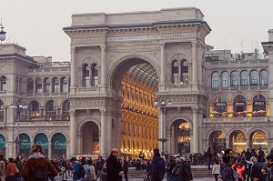
[1] Sir Henry Wotton says building something well must meet three conditions, “commodity, firmness, and delight.” The Galleria Vittorio Emanuele II in Milan, Italy is a perfect example of a building with a specific function, structural integrity, and a pleasing environment for all who enter.


http://www.carhirex.com/sites/carhirex.com/files/content/Galleria_Vittorio_Emanuele_II.jpg

Shopping in one of the greatest cities in the world needs to be a grand experience. Incorporating an enormous steel and glass dome as the focal point shows how important the function of this building is. No expense or architectural and engineering expertise were spared in the design and building of this galleria. Even if someone does not buy anything, the experience of being in such a beautiful, light filled space is delightful.

[2] Chinese design characteristics influenced the fabric below by using naturalistic motifs such as peonies. It also includes traditional Chinese ornament in the other flowers repeated in the design.The laws of the five elements, Yin and Yang, and Feng Shui affect the choice of bold colors, the spacing of the peonies in the patter, and the curvilinear forms in the background.


http://allfreed.ru/uploads/posts/1111/13071208612479_495009.jpg

[3] The lecture hall in the Ferguson Building where we gather for History of Architecture & Theory was built in the 1970s and is typical of that time. There is a lot of dark red and the ceilings are low which make it feel dark and cramped even though it is a large room. The rows are narrow and the seats are small. It is very different than the lecture halls in the newer buildings on campus that were built in the last five years. They have white walls, high ceilings, and windows. The attitude towards personal and social space has changed over the years in the US. Newer designs incorporate larger spaces, lots of windows, and more room for people to move around. In the 1970s, houses, cars, and people were smaller and the need for large open spaces wasn’t there. Even in 2010 in some cultures, this lecture hall would not feel so outdated. The need for more space is not a driving force in many countries not only in architecture but also in how people interact with each other. They stand closer and touch while talking, they live in smaller houses and their favorite car isn’t a SUV. I don’t need a big house or car, but I do like my personal space and our lecture hall is outdated for me since I seem to touch whoever I sit next to at least once each class.

[4] Can there be an Architecture of Happiness? I think that everything changes in time and therefore the beauty and happiness that are found in people and things at one moment will eventually fade. That is not to say it doesn’t change into some other form that promotes happiness, but we have to be open minded to see the change as positive. Alain de Bottom says “Architecture is perplexing, too, in how inconsistent is its capacity to generate the happiness on which its claim to our attention is founded.” A new building is grand and people who enter it feel happy and excited to be in the space. As it ages, only some will look at the cracks and old floors and appreciate the story of the building and still feel happy in it. The others will want to cover up the cracks or demolish it for a newer space thinking that will make them happy to see perfection again. We have to remember that nothing lasts forever and welcome the change. Otherwise we will be chasing a false happiness.


http://www.studentmarket.com/Cooper-Classics-4537-CO1666.html

I think this Starburst mirror exudes happiness because it represents the sun which helps people feel happy. The sun warms us and is needed for everything to grow.

Monday, August 23, 2010

HERE WE GO...

Summer was relaxing but a little too long! I was going to post some pictures before the semester started, but I didn't and of course now I'm too busy. Check back soon and I will have some posted. I'm glad to be back!

Saturday, May 22, 2010

More Semester 2 Work!

TRADING SPACES
Group Pin Up in lobby
(My drawing is on the far right)
4 WAYS
GROUP PROJECT

Sunday, May 2, 2010

Presentation Reflection

Presenting my design for the Resident Artist Studio space was an important way to conclude this project. Designing the space on paper and in SketchUp visually explained my design, but when I had to verbally present it, the heat was on. I went on the last day, which was helpful to hear feedback regarding my classmate’s presentations. Public Speaking is hard for a lot of people, but I was impressed with everyone’s presentations. I also appreciated the comments that our professor and TAs gave us. It was amazing to see 40 different designs and understand that there are endless ideas for any project. This inspires me to exceed my current level and collaborate with my classmates since I appreciated at least one innovative design aspect from each presentation.

Friday, April 30, 2010

Resident Artist Studio

We were asked to choose a current artist, research their studio, and use them as inspiration to design a resident artist studio in the Gatewood (IARC/Art) Building. I was assigned the loading dock area which is on the ground floor along with the wood shop, foundry, and ceramics studio. The space is a large concrete square and not much natural light enters into it. The artist was considered our "client" but other visiting artists may come so I needed to consider that while I was designing the space.


This is my final presentation board. Below is how I got here.

Loading Dock
I chose Ron Arad, a well known furniture designer & architect, because I really enjoy his use of arches, curvilinear lines, and industrial materials. I tried to incorporate those elements into this space while keeping the original style of the Gatewood Building in mind.

Chalk Farm Studio - London

His furniture design.

His well known Bookworm bookshelf.

This is the first SketchUp model I made.

Ground Floor Plan

Loft Floor Plan

Sample of one wall elevation


West Wall Perspective
East Wall Perspective

South East Wall Perspective

Loft Perspective

I will be adding my hand drawings later today.

Thursday, April 22, 2010

Clue 1: Storytelling In Perspective

So the Scavenger Hunt begins! Right after class I went to Starbucks in the EUC to sketch and to have their new Dark Cherry Mocha Frappuccino. That drink, hot or cold, is a treat. The vibe in the shop is upbeat and busy so I decided markers would show the mood well. The three people in my sketch were fun to observe. The guy on the left was wearing a BEANIE! It made me smile since we spent so much time in class talking about them. The girl in the middle had the coolest glasses, I need new glasses, I should have asked her where she got them. And the guy on the right relaxed me with his calm presence. I liked his spiked hair, headband, and vest. Monday I was awarded a scholarship! The ceremony in the EUC auditorium didn't start until 4pm, so I sat outside the building and ate an early dinner. I walked down the street to Boba House and got some very good Pad Thai. Since it was such a perfect spring day, I decided water color would provide the same softness that I felt about the day. I was tucked away in my corner just waiting and enjoying the white azalea bushes.

Friday, April 16, 2010

Monticello & Falling Water

This week, IARC took a road trip to Monticello in Virginia and Falling Water in Pennsylvania. Both homes were amazing for their time and being able to tour the interior space was a great experience.

We started the tour here but unfortunately we were unable to take any pictures of the inside of the home.
The views from the house were amazing.
We all wanted this space as our personal design studio.


This hallway is under the house and leads to where the "dependencies" worked and lived. Its a very different space than the main house.

The space under the house only had natural light from windows at ground level.
Thomas Jefferson's grave
On a lighter note...we had fun!


Falling Water is simply inspiring! Every square inch was thought about and I still cannot believe Wright completed the design in three hours after seeing the location only once! The home comes right out of the earth literally and connects perfectly with the nature around it. The owners of the home wanted it built near their favorite stream, but Wright decided to build it on top of the stream.
The owners brought many interesting artifacts back from their travels and were on display around the house. They fit in well since Wright's design was simple and organic.

Support beams go right into the rock.
This is a third generation tree and Wright did not want to remove it so he designed the beam to go around it.

Even the larger support beams were directly connected to the earth.
Lots of windows bring nature inside.

Some people sketched, I took pictures of them sketching.

This is one of my favorite pieces of furniture Wright designed for the home.